Stocks rebound as President Trump says not to worry… a new tool to help us time the end of this bull… the power of technical analysis… Wednesday’s Super AI Trading Event with TradeSmith CEO Keith Kaplan
VIEW IN BROWSER
Don’t worry about China, it will all be fine!
That social media post from President Trump is triggering a big rebound on Wall Street as I write Monday.
It’s a welcome relief after Friday’s sell-off, also triggered by Trump, when he accused China of “becoming very hostile” and threatened new 100% tariffs.
Wall Street remains hypersensitive to anything that could rattle the AI trade. Indeed, AI stocks are doing the heavy lifting of today’s bull market. So, any hint of calm – especially from Trump – quickly restores confidence in the sector driving most of 2025’s gains.
Speaking of AI and gains, AI chip supplier Broadcom Inc. (AVGO) announced a new multibillion-dollar deal this morning (as I write, it’s a mystery company – not OpenAI). It’s up 10%, and another sign that the AI boom is still driving big-money moves across tech.
Also from this morning, JPMorgan said it plans to invest in companies deemed “critical” to U.S. national security, many of which sit squarely in the AI supply chain.
Bottom line: From chipmakers to data infrastructure to big banks, the message is clear: The AI investing juggernaut isn’t slowing down.
Still, last Friday’s meltdown put one question front-and-center for investors…
How will I know when to get out?
Let’s answer it.
To help, we’ve already introduced our “Crazy Map.” It’s a list of five milestones that often line the path to a bull market’s eventual peak/bust. We’re tracking them with a “green, yellow, red” scoring system (today, three are yellow, two are already red).
But while the Crazy Map is helpful for signaling when the broad market is likely in its final innings, those innings can last far longer than expected. So, we need another tool – something more precise even once we conclude we’re in the ninth.
This brings us to senior analyst Brian Hunt… some easy-to-follow technical analysis… and a guide to help you sidestep the worst of whatever market collapse might be lurking ahead.
Today, let’s dig into exactly how to navigate the end of this bull market. Depending on your financial situation, this issue could save you millions of dollars and loads of sleepless nights.
Then, after detailing our action plan, I’ll share with you an AI-based trading tool to help you trade however much bull market remains ahead. It delivered an average annual gain of 374% in a rigorous five-year study spanning pandemics, crashes, and global turmoil. It could be one of the most profitable ways to trade whatever blow-off top is in our future.
Lots to cover. Let’s jump in…
Your “sleep in peace” game plan for navigating the end of a bull market
For newer Digest readers, Brian used to helm InvestorPlace as CEO, but his first love has always been trading and investing.
So, after choosing to hand over the CEO reins, he’s now one of our leading senior analysts, dissecting the markets and teaching other investors how to consistently put wads of trading cash in their pockets.
Recently, in an internal InvestorPlace email, Brian detailed how he plans to navigate “the top.” It’s based on how he sidestepped the worst of the market collapse in 2008/2009, along with an analysis of how his approach performed when tested against the 2000 crash.
It involves basic trend analysis that Brian writes “can help you avoid every major stock crash for the rest of your life.”
From Brian:
The chart below shows how the stock market enjoyed a strong rally from late 2004 to late 2007.
But then, way before the market meltdown, the S&P began exhibiting terrible price action behavior. These behaviors were bright red warning flags.
In the chart below, you’ll see that in early 2008, the S&P 500 undercut two of its major 2007 lows. This was a 6-month downside breakout. The lowest low in six months (A). This is a major negative for any market.
Then, the S&P’s 200 day moving average turned lower (B). This is a major negative for any market. Then, the S&P staged a downside breakout to new 12-month lows (C).
This bearish move was accompanied a clear series of bearish “lower highs and lower lows.” This is a major negative for any market.
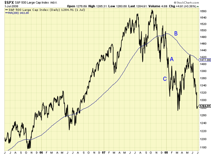
Source: StockCharts.com
Put it all together, and by early 2008 – six months before the worst of the market’s collapse – Brian had spotted clear signs that it was time to get defensive:
To me, this horrid action is not obvious only in hindsight. It was obvious at the time.
And you didn’t need one ounce of mortgage market insight to know the market was sick.
You just needed a basic knowledge of stock trend health that can be learned in a variety of entry level books.
Sure enough, here’s how it played out (notice how much you saved if you’d acted after Brian’s “A, B, C” warning system):
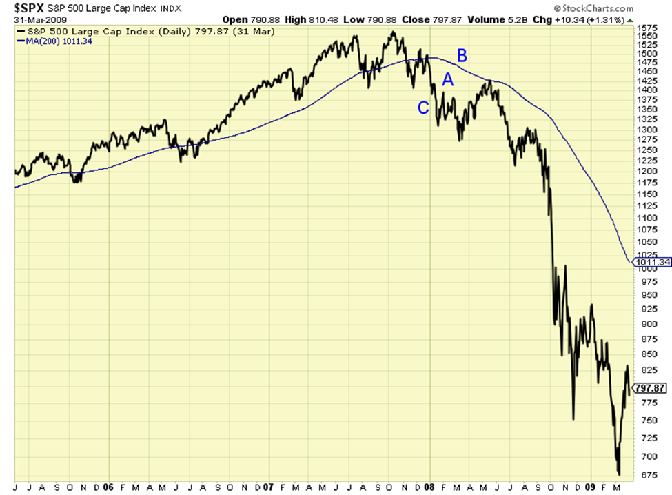
Source: StockCharts.com
Back to Brian:
The majority of one of the worst bear markets in history could have been avoided by using basic technical analysis.
The same “A, B, C” warnings were evident in the Dot-Com Crash
As you’ll see below, from mid-1998 to mid-2000, the market provided the same warnings:
- A six-month downside breakout (A)
- Trading below a declining 200-day moving average (B)
- A new series of lower highs and lower lows on the way to a new 12-month low (C)
From Brian:
All major negatives by themselves. Combined, they were hugely negative.
That was the time to get out.
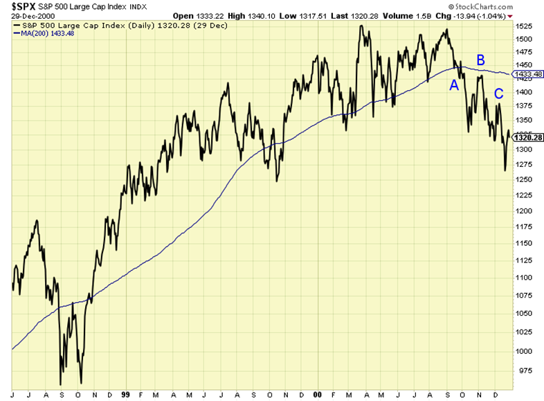
Source: StockCharts.com
And then this happened:
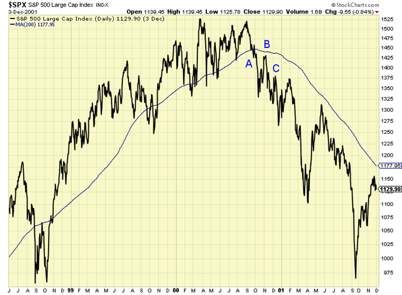
Source: StockCharts.com
Where this leaves us today
So, first, we have the Crazy Map signaling when we’re in the neighborhood of a potential crash. Our latest analysis suggests we’re turning into that neighborhood, but not squarely in it today.
Second, we have Brian’s technical framework that helps us identify, let’s call it, the specific street to be cautious about. We’re definitely not there yet.
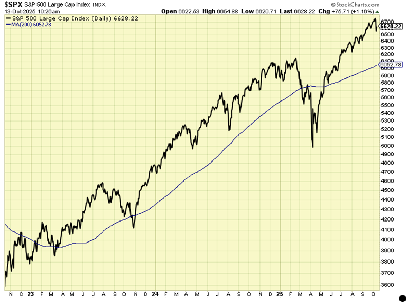
As you can see below, we’re nowhere close to trading at six- or 12-month lows, trading below the 200-day MA, or establishing “a new series of lower highs and lower lows.”
Source: StockCharts.com
Let’s now throw in one final wrinkle to help us with our conviction. We’ll factor in one of the most important yet underutilized indicators in investing.
Volume: the truthteller before price
Price tells us what is happening, but volume tells you how real it is.
Near major market tops or changes in trend, that distinction becomes crucial. After all, how many times have you bought into what you believed was the start of a new market uptrend, only for it to reverse and leave you sitting on sudden losses?
In healthy bull markets, rallies are confirmed by expanding volume – more buyers piling in, more conviction behind each advance.
But as a market begins to tire, that relationship quietly flips…
On “up” days, you’ll start to see shrinking volume. This means fewer investors are willing to chase prices higher. This is followed by sharp “down” days where volume suddenly swells.
That’s often institutions unloading their positions. It’s the “smart money” exiting while retail investors are still celebrating new highs.
This subtle shift in participation is one of the clearest tells of a topping process.
When the heaviest trading sessions start clustering around down days rather than up days, the baton has passed from the “accumulation” phase of a rising market to the “distribution” phase of a market that’s topped out.
Today, we’re seeing some signs that bullish buying volume is slightly softening, but nothing significant enough for us to pronounce a true pivot.
Now, let’s fold this into Brian’s “A, B, C” framework
When we do, volume becomes the force multiplier that validates each technical breakdown:
- When the market posts its first 6-month downside breakout (“A”), check if that drop comes on surging volume, far outpacing volume on recent bullish days. If so, that’s a red flag that the selloff has conviction. And as importantly, if there’s an ensuing rebound rally, how much buying volume is driving it? If it’s light, watch out.
- When price slips below a declining 200-day moving average (“B”), heavy volume confirms the long-term trend has turned. Does the new status quo bring heavier selling volume days than buying days?
- And when a fresh 12-month low arrives (“C”) with a series of lower highs and lower lows, rising volume on down days locks in the verdict: The bulls have lost control.
So, integrating price and volume in this way gives you an early, objective framework to exit with confidence (not panic).
By the time the headlines catch up, you’ll already be on the sidelines, watching the chaos from cash.
But recognize what this means – you won’t get out at “the top”
Here’s the truth that most investors don’t want to hear: This framework won’t get you out at the exact top.
But that’s not a flaw, it’s a feature of disciplined investing. You’ll always “pay” something for prudence – unless you get incredibly lucky and sell at the exact top, which almost never happens.
And even selling at the top would bring a cost. For example, if you sell today – basically at the market’s all-time high – your “cost” is opportunity. You risk watching stocks sturdy themselves from recent wobbles and explode higher, leaving you on the sidelines for the final leg of this bull. Who knows how much higher we’ll go?
On the other hand, if you wait for Brian’s “A, B, C” signals to confirm that the market has truly broken down, your cost is real portfolio drawdown – the decline between the peak and the point where “C” triggers your exit.
In Brian’s examples, depending on exactly where you exit, that could be between 15% and 20% lower.
Either way, there’s a cost. It’s your call as to whether you’d prefer to pay in “potential missed opportunity” or “realized drawdown.” The right answer will be unique to you and your financial situation/goals. Fortunately, you can dial it up or down.
Whatever you choose, recognize the bigger goal: avoiding the worst of a real bear market crash to prevent catastrophic portfolio damage.
So – putting it all together – how will you know when to get out?
Between the Crazy Map’s broad warning signs, Brian’s A, B, C framework, and the confirming story told by volume, you now have a practical roadmap for a specific exit based on a plan – not emotion.
It’s not so much about perfection but, rather, protection. Following this type of framework will help you sidestep the kind of massive losses that can erase years of hard-earned gains and keep your capital intact for the next great buying opportunity.
Speaking of opportunity…
While this roadmap prepares you for the end of the bull, there’s still money to be made while it lasts.
In fact, a powerful new AI-driven trading tool from our corporate affiliate TradeSmith may be the smartest way to capture whatever upside remains – before the final inning ends.
As we profiled in the Digest last week, TradeSmith’s newest innovation, the AI Super Portfolio, is the most powerful quant-based trading breakthrough we’ve ever seen.
Built on years of research and powered by TradeSmith’s proprietary machine learning engine, this strategy layers a next-generation algorithm on top of Predictive Alpha Prime, which is TradeSmith’s most advanced AI forecasting system.
The result is a five-position portfolio that continually rotates into the stocks that the screening AI believes have the highest probability of outperforming over the coming months.
In extensive five-year testing, the AI Super Portfolio delivered average annual gains of 374% – that’s through the pandemic, rate hikes, trade wars, and every market twist in between.
To be clear, you don’t have to use options or leverage. There’s nothing crazy here. Just the market’s top stocks, held for AI-determined periods, rebalanced twice a year.
To see exactly how it works, join TradeSmith CEO Keith Kaplan this Wednesday, Oct. 15, at 10 a.m. ET for his Super AI Trading Event.
He’ll walk you throw how this system takes AI-powered investing to an entirely new level – and how you can use it to trade smarter in whatever remains of this bull market.
Have a good evening,
Jeff Remsburg